Case study · Brand & digital
Apapesse
Reciclagem
Live website · Brazil
Scroll to explore ↓
A circular idea, made visible.
A system designed to give value back.
Apapesse has operated in Vale do Ribeira since 2009, working with paper, cardboard, plastic, metal, glass, post-consumer oils, rubber and other recyclable materials.
Dingo Lab developed the logo, monogram, icon system and website as one connected identity. The circular arrow carries continuity and return, while the leaves bring the system back to its environmental purpose.

One mark. One continuous movement.
Circular by design.
A mark that turns recovery into forward movement.
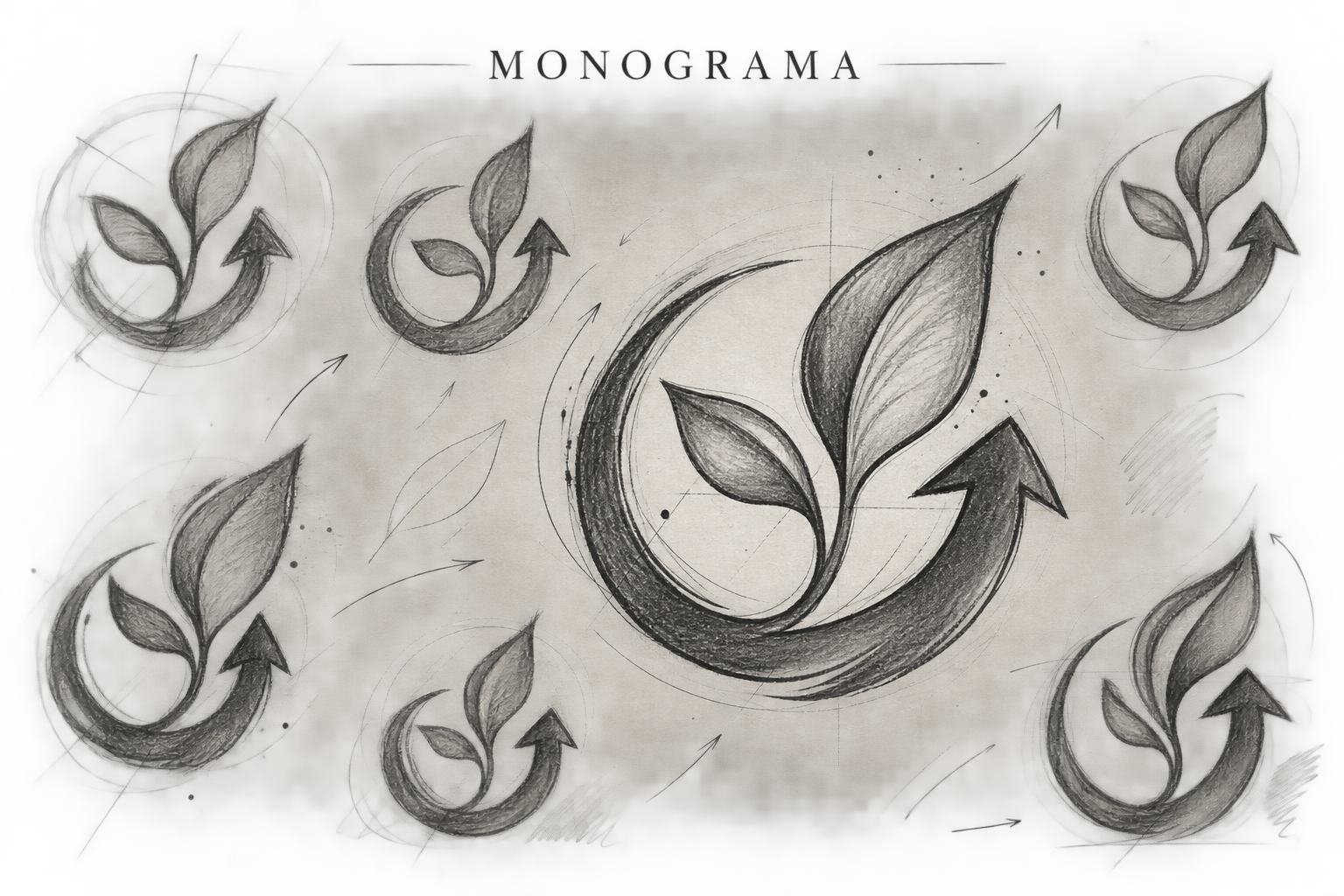
Drawn from a cycle.
The development sketches explore the balance between leaf, arrow and circular form. The final monogram condenses the brand idea into a compact symbol that remains recognisable across digital and physical applications.
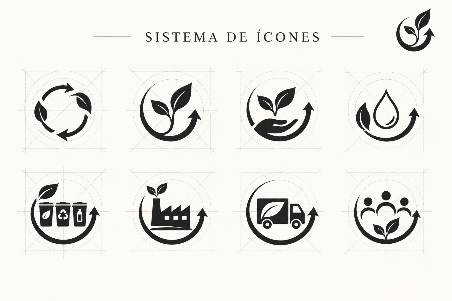
One visual grammar. Eight operational stories.
The icon family extends the monogram’s curves and directional movement into a practical communication system for circularity, growth, collection, industry, transport and community.
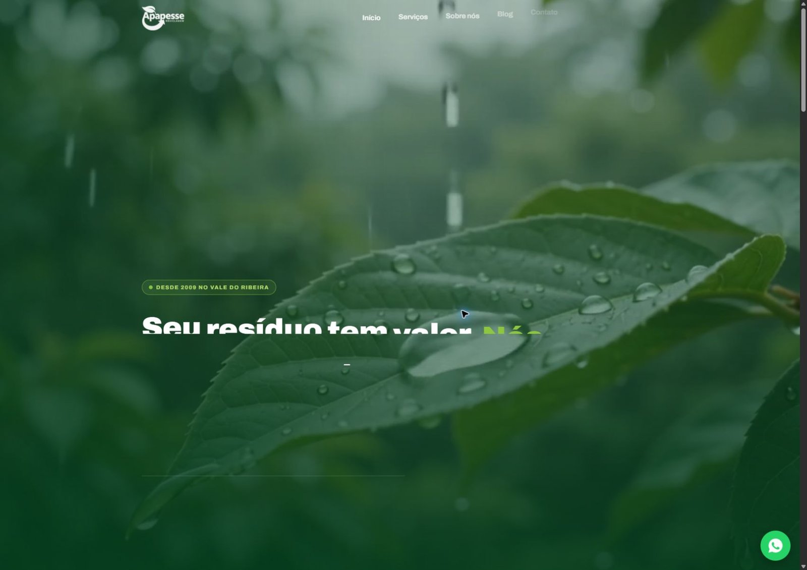
The brand becomes a working website.
The single-page experience leads visitors from purpose to services, documentation, company story and contact without losing the directness of an operational business.
Large typography, natural footage, responsive structure, accessible navigation and focused contact routes translate a technical service into a clear digital journey.
From the first sketch to a live digital system.
A connected identity in which the logo, visual language, icons and website all communicate the same idea: material can return, transform and create value again.
Visit the live website ↗